The Data and Its Presentation
The CT Environmental Justice Screening tool includes many types of data that show which Connecticut communities are experiencing more pollution and more health concerns than others, as well as other social and economic characteristics of these communities.
Each individual data set is called an indicator, and represents a particular type of pollution, health impact, or social vulnerability. For example, one indicator represents all the landfills in Connecticut, while another indicator represents unemployment rates. The tool organizes those indicators into composite indices, which are combinations of similar types of indicators. For example, the landfill indicator is combined with all of the other potentially-polluting facilities indicators into a composite index called Potential Pollution Sources. The unemployment indicator, on the other hand, is combined with all of the other social and economic indicators into a composite index called Socioeconomic Factors.
A full list of the indicators in the tool and the composite indices that are created from each group of indicators can be found here.
These composite indices can be useful for getting a big-picture look at the multiple impacts a community may be facing at the same time. For instance, a community may be experiencing air pollution, water pollution, AND exposure to toxic chemicals all at once. In this case, the combined risk would be the average of the risks from each hazard, taking into account the likelihood and severity of each risk.
The tool includes a total of 51 individual indicators that users can display on the map. The users can also choose to display multiple composite indices to show different combinations of indicators. Some composite indices are “nested” inside of others. The diagram below shows how four composite indices of indicators (Potential Pollution Sources, Potential Pollution Exposure, Socioeconomic Factors, and Health Sensitivity) are organized into two broader composite indices (Pollution Burden and Sensitive Populations), and how those broader composite indices in turn are combined to get the overall Environmental Justice Index Score.
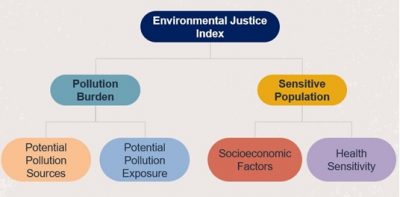
Figure 1: In the CT Environmental Justice Screening Tool, individual indicators are organized into four categories (Potential Pollution Sources, Potential Pollution Exposure, Socioeconomic Factors, and Health Sensitivity), and each of these four categories has a composite rank based on the average rank of all the indicators inside the category. Potential Pollution Sources and Potential Pollution Exposure, when combined together, become the Pollution Burden Composite Index. Socioeconomic Factors and Health Sensitivity, when combined together, become the Sensitive Populations Composite Index. Finally, Pollution Burden and Sensitive Populations are combined together to produce the final Environmental Justice Index Score.
More information on each of the composite indices is given below:
Pollution Burden
The Pollution Burden composite index represents the potential exposure to pollutants and adverse environmental conditions caused by pollution. As seen in the diagram above, Pollution Burden is a combination of two different composite index categories:
- Potential Pollution Sources:The indicators in this category show proximity to different sites with the potential to produce pollution, such as brownfields, incinerators, underground storage tanks, and more.
- Potential Pollution Exposure: The indicators in this category illustrate measured environmental concentrations and releases of contaminants that are present in the air, water, or land.
The Pollution Burden index is calculated using the average of the Potential Pollution Sources and Potential Pollution Exposure categories, with the Potential Pollution Exposure counted twice as much as the Potential Pollution Sources (because direct exposure to pollution is considered a higher impact than proximity to a potential pollution source).
Marginalized communities may be disproportionately affected by pollution for a variety of reasons. These communities may be more likely to be located near sources of pollution, such as industrial facilities or waste dumps. They may have less ability to advocate for changes to reduce these risks. Addressing the pollution burden experienced by communities is an essential part of environmental justice. It entails working to lessen the unequal distribution of pollution and enhance the health and well-being of these communities.
Sensitive Populations
The Sensitive Populations composite index refers to a community’s demographic, health, and socio-economic characteristics that may make it more vulnerable to environmental hazards. As seen in the diagram above, Sensitive Populations is a combination of two different composite index categories
- Health Sensitivity: The indicators in this category represent people with health conditions who may be more likely to be affected by pollutants, such as people with asthma or poor mental health.
- SocioEconomic Factors: The indicators in this category represent social and economic conditions challenges faced by communities, which may make it harder for people to participate in environmental decision-making and less able to protect themselves from the impacts of pollution.
How to Interpret the Map
The map shows the potential cumulative impact on communities disproportionately affected by pollution. The indicators are assigned numerical values to represent how each census tract compares to all other census tracts in Connecticut with regard to the conditions that the data represents. Each census tract is assigned a rank from 0 to 10 that is used to measure the relative difference of potential impact factors between different census tracts. For composite indices, each indicator’s rank averages are computed and then assigned the relative ranking. Each rank represents 10% of the total census tracts within the state. The ranking provides a common scale to compare various issues at the community level and to assess the cumulative impact of the indicators across all communities (Min et al., 2019b). The map displays the ranks from 0 (least impacted) to 10 (most impacted) (Figure 5). When a specific indicator is not present in a tract, or if the data for that indicator in that tract is, not available or not reported, the tract’s ranking for that indicator is reported as Not Available Data. Rankings can help to highlight areas where certain hazards or impacts are more severe and can be used to identify patterns in the distribution of environmental risks. It is important to note that the ranks do not specify how much the numerical difference is between each tract, but rather where each tract falls on the overall distribution of tracts across the state.
Darker areas = Higher rankings = Higher potential impact
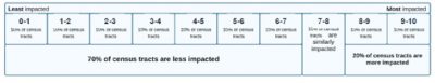
Figure 2: General Rank representation of the indicators and indices
For example, suppose a census tract has a rank of 8 for Pollution Burden. The diagram above displays how each of the ten ranking tiers corresponds to 10% of the census tracts in the state. In this case, ranks 1 –7 (representing 70% of the census tracts) are less impacted than the selected census tract, and ranks 9 – 10 (representing 20% of the census tracts) are more impacted than the selected census tract. The remaining 10% of the census tracts are comparable to the selected census tract, ranked 8. (Figure 2).
Not Available data is excluded from the ranking calculation when geographical areas do not have reliable indicators (e.g., data is uncertain). This way, ranking scores can be considered as comparisons between a state’s census tracts only where affected areas are present.
The screening tool includes a color-coded map and can be used to create a standard report for a user-selected area. Users should remember that when looking at specific locations, some of the towns on the state border can have some uncertainties that deal with demographic and environmental data. This is due to the nature of boundary application to environmental data or census tract level socioeconomic data uncertainties at the boundaries. It is also important to note that, while the census tract scale of data provides a broad overview, it can obscure specific environmental justice issues occurring within smaller communities or sub-regions of a census tract. Consequently, a large census tract that appears to be less impacted overall may still have pockets of great vulnerability within it.