Data Overview
To explain the user information of the mapping tool, you can find videos and the user guide, which can serve as your virtual navigator. If there are any other issues and or topics that we have not addressed, please feel free to send us a message through our Public Feedback " and, the detailed information can be found in the report.
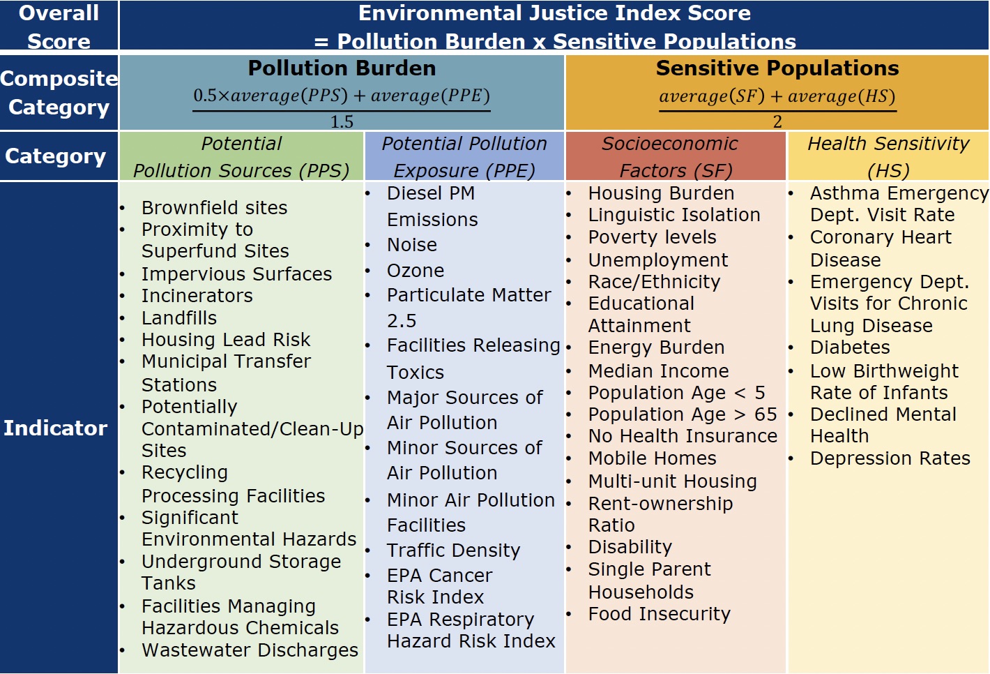
Understanding the Indicators
Breaking down the methodology behind the scores given to the census tracts based on the indicators, this chart provides insight on what exactly is included.
The list of the indicators and their resolution and source can be reached from
Cumulative Indices
Cumulative or composite impact in the CT EJ Mapping Tool context refers to the overall effect of all combined indicators on a specific census tract and/or region. Besides the indicators, we utilized cumulative indices to determine these communities' burdens. The model has seven cumulative indices which impact the CT EJ index. These indices are calculated in percentiles but converted into ranks changing from 0 (least impacted) to 10 (most impacted).
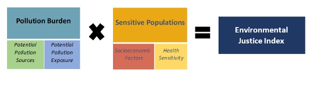
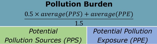
Pollution Burden
Pollution Burden represents the potential cumulative exposure to pollutants and adverse environmental conditions. The Pollution Burden index is a combination of the Potential Pollution Sources and Potential Pollution Exposures indicators. The calculated average Pollution Burden score for each census tract are normalized into percentiles and impact rank scores between 0 (least impacted) to 10 (most impacted).
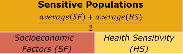
Sensitive Populations
Sensitive Populations: This composite index refers to a community’s demographic, health, and socioeconomic characteristics that may affect its vulnerability to environmental hazards. This index reflects biological and societal elements that can increase the susceptibility of a community to environmental conditions. This index is a combination of Socioeconomic Factors and Health Sensitivity. The calculated average Sensitive Populations score for each census tract are normalized into percentiles and impact rank scores between 0 (least impacted) to 10 (most impacted).
Breakdown of Indicators and Indices
These indicators were categorized into four categories: Potential Pollution Sources, Potential Pollution Exposure, Socioeconomic Factors, and Health Sensitivity. From here, these indicators were able to establish what factors are in these overburdened communities. These indicators then help establish the overall composite score and are presented on the mapping tool. To explore the breakdown of the indicators and the data associated with them, click on the categories below.
Potential Pollution Exposure (PPE)
Potential Pollution Exposure (PPE):
is a composite of multiple indicators that are the estimated level of exposure to environmental pollutants within census tracts. The indicators illustrate measured environmental concentrations and releases of contaminants from pollution sources.
Diesel PM Emission: This indicator represents the tracts ranked by their percentile level of diesel particulate matter emissions from on-road and non-road sources. The ranks are displayed from 0 (lightest) to 10 (darkest), from least impacted to most impacted, respectively. (Data Source: EPA EJSCREEN 2022, National Emissions Inventory, EPA Hazardous Air Pollutants 2017)
EPA Air Toxins Assessment Cancer Risk: This indicator represents the tracts ranked by their percentile level of lifetime cancer risk from inhalation of air toxics, persons per million lifetime. The ranks are displayed from 0 (lightest) to 10 (darkest), representing the least to highest rates given, respectively. (Data Source: 2017 Air Toxics data Update, EPA EJSCREEN 2022 )
EPA Air Toxins Assessment Respiratory Hazard Risk: This indicator represents the tracts ranked by their percentile level of the air toxics respiratory hazard index (ratio of exposure concentration to health-based reference concentration). The ranks are displayed from 0 (lightest) to 10 (darkest), representing the least to highest rates given, respectively. (Data Source: 2017 Air Toxics data Update, EPA EJSCREEN 2022 )
Facilities Releasing Toxins (TRI Facilities): This indicator represents the tracts ranked by their percentile of proximity to the facilities that are releasing toxic chemicals into the air and off-site incineration. The Toxics Release Inventory (TRI) from the U.S. EPA gathers data annually about environmental releases of toxic chemicals from industrial facilities. The ranks are displayed from 0 (lightest) to 10 (darkest), from least impacted to most impacted, respectively. (Data Source: TRI Form R and A 2021 U.S. Environmental Protection Agency and CT Department of Energy and Environmental Protection.)
Minor Facilities with Permit-limited Emissions Potential: This indicator represents the tracts ranked by their percentile of proximity to the facilities that are minor air pollution emitters. Minor facilities are regulated under the Permit-by-Rule program known as Section 22a-174 33a and Section 22a-174 33b of the Regulations of Connecticut State Agencies, which limits their pollution emission potential to a level below that of major air pollution facilities, also known as Title-V permit. The ranks are displayed from 0 (lightest) to 10 (darkest), from least impacted to most impacted, respectively. (Data Source: 2023 Section 22a-174 33a and 33b facilities CT DEEP Bureau of Air Management)
Noise: This indicator represents the tracts ranked by their percentile level of equivalent average noise energy due to transportation noise sources over a 24-hour period from aviation, rail and Interstate Road noise. Ranks are displayed from 0 (lightest) to 10 (darkest), from least impacted to most impacted, respectively. (Data Source: U.S. Department of Transportation, Bureau of Transportation Statistics, National Transportation Noise Map, 2018)
Ozone: This indicator represents the tracts ranked by their percentile level of daily 8-hour annual average surface-level O3 concentrations modeled over 1km x 1km plots in 2016. The ranks are displayed from 0 (lightest) to 10 (darkest), from least impacted to most impacted. (Data Source: NASA Socioeconomic Data and Applications Center and Environmental Science and Technology )
Particulate Matter 2.5: This indicator represents the tracts ranked by their percentile level of daily 8-hour annual average surface-level PM2.5 concentrations modeled over 1km x 1km plots in 2019. The ranks are displayed from 0 (lightest) to 10 (darkest), from least impacted to most impacted. (Data Source: Atmospheric Composition Analysis, Washington University in St. Louis. and American Chemical Society)
Permitted Major Air Pollution Sources: This indicator represents the tracts ranked by their percentile of proximity to the facilities with active Title V permits to regulate the facility emissions for the following Criteria Air Pollutants: carbon monoxide, nitrogen oxides and volatile organic compounds, sulfur dioxide, lead, and particulate matter. The ranks are displayed from 0 (lightest) to 10 (darkest), from least impacted to most impacted, respectively. (Data Source: 2021 Title V permits - CT DEEP Bureau of Air Management)
Permitted Minor Air Pollution Sources/Equipment/Processes: This indicator represents the tracts ranked by their percentile of proximity to the facilities permitted minor air pollution sources (equipment) with New Source Review permit locations. Registered equipment permitting minor air pollution can include school boilers, turbines, engines, etc. The ranks are displayed from 0 (lightest) to 10 (darkest), from least impacted to most impacted, respectively. (Data Source: 2021 New Source Review Permits - CT DEEP Bureau of Air Management)
Traffic Density: This indicator represents the tracts ranked by their percentile sum of traffic volumes adjusted by road segment length (vehicle kilometers per hour) divided by total road length (kilometers) within 150 meters of the census tract boundary. The ranks are displayed from 0 (lightest) to 10 (darkest), from least impacted to most impacted, respectively. (Data Source: 2020 Traffic Monitoring Annual Average Daily Traffic Report, CT Department of Transportation)
Urban Heat Island: This indicator represents the tracts ranked by their percentile level of percentage of observations of Urban Heat Islands intensities, which refer to the phenomenon where cities experience higher temperatures than the surrounding rural areas. The ranks are displayed from 0 (lightest) to 10 (darkest), from least impacted to most impacted, respectively. (Data Source: 2003-2018 UHI Earth Engine Data Catalog. (Chakraborty and Lee, 2019))
Potential Pollution Sources (PPS)
Potential Pollution Sources (PPS)
is a composite of multiple indicators that are designed to reflect the potential effects on the environment. These indicators can include the presence of certain types of pollution or potential sources of environmental harm on nearby communities.
Brownfield Sites: This indicator represents the tracts ranked by their percentile proximity to brownfield sites. These sites are once used for industrial, manufacturing, or commercial uses, have been abandoned or underutilized due to known or suspected contamination from past uses.The ranks are displayed from 0 (lightest) to 10 (darkest), from least impacted to most impacted, respectively. (Data Source: CT DEEP Hazardous Waste Inventory 2021, Brownfields)
Facilities Managing Hazardous Chemicals (EPCRA Tier II): This indicator represents the tracts ranked by their percentile proximity to Emergency Planning and Community Right-to-Know Act (EPCRA) Connecticut State Emergency Response Commission, Tier II chemical inventory data. The ranks are displayed from 0 (lightest) to 10 (darkest), from least impacted to most impacted, respectively. (Data Source: EPCRA Tier II Locations, CT DEEP-CT SERC, 2021)
Lead Paint Risk in Housing: This indicator represents the tracts ranked by their percentile of percent of houses that are built before 1979. The ranks are displayed from 0 (lightest) to 10 (darkest), from least impacted to most impacted, respectively. (Data Source: American Community Survey)
Impervious Area: This indicator represents the tracts ranked by their percentile of average impervious areas (streets, buildings and parking lots). The ranks are displayed from 0 (lightest) to 10 (darkest), from least impacted to most impacted, respectively. (Data Source: 2021 MRLC Impervious Land Cover)
Incinerator/Resource Recovery Facilities: This indicator represents the tracts ranked by their percentile proximity to incinerators, that convert municipal solid waste to energy. The ranks are displayed from 0 (lightest) to 10 (darkest), from least impacted to most impacted, respectively. (Data Source: Connecticut Resource Recovery Facilities, 2020)
Landfill Sites: This indicator represents the tracts ranked by their percentile proximity to solid waste disposal areas, including, but not limited to, a landfill that contains ash, construction and demolition debris or solid waste. The ranks are displayed from 0 (lightest) to 10 (darkest), from least impacted to most impacted, respectively. (Data Source: Active Landfills 2020, and Affecting Facilities 2021)
Municipal Transfer Stations: This indicator represents the tracts ranked by their percentile proximity to municipal stations where garbage collection vehicles unload their contents. The ranks are displayed from 0 (lightest) to 10 (darkest), from least impacted to most impacted, respectively. (Data Source: 2020 CT DEEP Municipal Waste Disposal Data)
Potentially Contaminated Sites: This indicator represents the tracts ranked by their percentile proximity to clean up sites that can include property Transfer Program, federal remediation programs, state remediation program, urban site remediation program, general permit, discharge authorization and enforcement. Cleanup sites include Resource Conservation and Recovery Act (RCRA) Closure and Corrective Action, Voluntary Remediation Connecticut General Statutes (CGS) sections 22a-133x and 22a-133y and abandoned brownfields cleanups. The ranks are displayed from 0 (lightest) to 10 (darkest), from least impacted to most impacted, respectively.(Data Source: 2021 CT DEEP Hazard Waste Inventory, Remediation Department)
Proximity to Superfund Sites: This indicator represents the tracts ranked by their percentile proximity to sites proposed and listed on the National Priorities List (NPL). National Priorities List (NPL) sites, are unregulated, abandoned hazardous waste sites that the federal government is given jurisdiction over for remediation efforts. The ranks are displayed from 0 (lightest) to 10 (darkest), from least impacted to most impacted, respectively.(Data Source: 2022 EPA CERCLIS database)
Recycling Facilities/Materials Recovery Facilities: This indicator represents the tracts ranked by their percentile proximity to materials recovery facilities (MRF), also known as a recycling processing facility, which is a plant that specializes in receiving and sorting single-stream recycling to sell to buyers for reuse in the product. The ranks are displayed from 0 (lightest) to 10 (darkest), from least impacted to most impacted, respectively. (Data Source: 2018 CT DEEP Recycling Processing Facilities)
Significant Environmental Hazards/Proximity to Facilities with Highly Toxic Substances: This indicator represents the tracts ranked by their percentile proximity to active, resolved and controlled cases of significant hazards because they pose a potential short-term health risk to exposed individuals or the environment defined by Connecticut General Statues Section 22a-6u. The ranks are displayed from 0 (lightest) to 10 (darkest), from least impacted to most impacted, respectively. (Data Source:2023 Significant Environmental Hazards, CT DEEP )
Underground Storage Tanks: This indicator represents the tracts ranked by their percentile proximity to non-residential that stores oil, petroleum, and chemical liquids. The ranks are displayed from 0 (lightest) to 10 (darkest), from least impacted to most impacted, respectively. (Data Source: 2021 CT Gov active underground storage tanks (USTs) Facilities)
Wastewater Discharge: This indicator represents the tracts ranked by their percentile level of wastewater discharge Risk-Screening Environmental Indicators (RSEI) Model modeled Toxic Concentrations at stream segments within 500 meters, divided by distance in kilometers (km) calculated to stream segments. The ranks are displayed from 0 (lightest) to 10 (darkest), from least impacted to most impacted, respectively.(Data Source: 2019 Risk-Screening Environmental Indicators (RSEI) modeled results from by EPA’s Office of Pollution Prevention and Toxics (OPPT) on March 15, 2021)
Socioeconomic Factors (SF)
Socioeconomic Factors
is a composite index assesses social and economic conditions within assesses social and economic conditions within a census tract? Indicators in this category entail burdens and how they relate to the larger picture of environmental justice. These indicators identify the conditions that communities face, which amplify their stress or complicate their living situations. While these social vulnerabilities don't intensify the pollution itself, they do make it more challenging for these communities to seek relief from pollution, move away from affected areas, or effectively cope with its consequences.
Educational Attainment: This indicator represents the tracts ranked by their percentile level of percentage of people 25 years and older who do not have high school diplomas. Rank is calculated by the percentage of the population in each census tract aged 25 and older without a high school diploma. This displays a rank from 0 (lightest) to 10 (darkest), from least impacted to most impacted, respectively. (Data source: 2017-2021 American Community Survey, 5-year estimates)
Elderly Population: This indicator represents the tracts ranked by their percentile level of percentage of people 65 years and older. The percentile is determined by the percentage of people 65 years and older within each census tract. The rank is determined by dividing the percentile into 10 equal thresholds. The map displays ranks from 0 (lightest) to 10 (darkest), from least potentially at-risk population to most, respectively. (Data source: 2017-2021 American Community Survey, 5-year estimates)
Energy Burden: This indicator represents tracts ranked by their percentile level of percentage of household income spent on energy costs. The building energy burden percent field and that field was directly used to calculate percentile and rank. The rank is determined by dividing the percentile into 10 equal thresholds. The map displays ranks from 0 (lightest) to 10 (darkest), from least potentially burdened to most, respectively. (Data Source: 2020 Low-Income Energy Affordability Data (LEAD))
Housing Burden: This indicator represents the tracts ranked by their percentile level of percentage of households who spend 30% or more of their yearly household income on housing costs. Percentile is calculated for each census tract by determining the percentage of households who spend 30% or more of their yearly household income on housing costs and then divided into 10 equal rank thresholds. This displays a rank from 0 (lightest) to 10 (darkest), from least impacted to most impacted, respectively.(Data source: 2017-2021 American Community Survey, 5-year estimates)
Food Insecurity: This indicator represents the tracts ranked by their percentile level of percentage of households that use the Supplemental Nutrition Assistance Program (SNAP). Percentile is calculated for each census tract by determining the percentage of households on the Supplemental Nutrition Assistance Program and then divided into 10 equal specific thresholds. This displays a rank from 0 (lightest) to 10 (darkest), from least impacted to most impacted, respectively. (Data source: 2017-2021 American Community Survey, 5-year estimates)
Lack of Tree Canopy: This indicator represents the tracts ranked by their percentile level of average percentage of tree canopy estimates. The is the average tree canopy coverage for each tract is used for percentile calculation. The reverse of the percentiles are normalized into impact rank scores to represent the lack of coverage between 0 (least impacted) to 10 (most impacted). (Data Source: 2021 MRLC Tree Canopy Cover)
Linguistic Isolation: This indicator represents the tracts ranked by their percentile level of percentage of limited English-speaking population over five years of age. Percentile is calculated for each census tract by determining the percentage of a limited English-speaking population over five years of age and then divided into 10 equal-rank thresholds. This displays a rank from 0 (lightest) to 10 (darkest), from least impacted to most impacted, respectively. (Data source: 2017-2021 American Community Survey, 5-year estimates)
Median Income: This indicator represents the tracts ranked by their percentile level of median household incomes per census tract, per capita income. The percentile is determined from the lowest to highest median household income for each census tract. The rank is determined by dividing the percentile into 10 equal thresholds. The map displays ranks from 0 (lightest) to 10 (darkest), from the highest median income to the lowest, respectively. (Data source: 2017-2021 American Community Survey, 5-year estimates)
Mobile Homes: This indicator represents the tracts ranked by their percentile level of percentage of mobile home housing units. Percentile is calculated for each census tract by determining the percentage of mobile home housing units per census tract and then divided into 10 equal rank thresholds. This displays a rank from 0 (lightest) to 10 (darkest), from least impacted to most impacted, respectively. (Data source: 2017-2021 American Community Survey, 5-year estimates)
Multiunit Housing: This indicator represents the tracts ranked by their percentile level of percentage of multi-unit housing units. Percentile is calculated for each census tract by determining the percentage of multi-unit housing units per census tract and then divided into 10 equal rank thresholds. This displays a rank from 0 (lightest) to 10 (darkest), from least impacted to most impacted, respectively. (Data source: 2017-2021 American Community Survey, 5-year estimates)
No Health Insurance: This indicator represents the tracts ranked by their percentile level of percentage of the population without health insurance. Percentile is calculated for each census tract by determining the percentage of the population without health insurance per census tract and then divided into 10 equal-rank thresholds. This displays a rank from 0 (lightest) to 10 (darkest), from least impacted to most impacted, respectively.(Data source: 2017-2021 American Community Survey, 5-year estimates)
No Vehicle Access: This indicator represents the tracts ranked by their percentile level of percentage of the population without access to a vehicle. Percentile is calculated for each census tract by determining the percentage of the population without vehicle access per census tract and then divided into 10 equal-rank thresholds. This displays a rank from 0 (lightest) to 10 (darkest), from least impacted to most impacted, respectively. (Data source: 2017-2021 American Community Survey, 5-year estimates)
Race/Ethnicity: This indicator represents the tracts ranked by their percentile level of percentage of sum of all race/ethnicity categories except White/Non-Hispanics The all the race and ethnicities are represented by substracting the Non-Hispanic/white alone category from the total population. The percentile is determined from the percentage of all the race over the total population within each census tract. The rank is determined by dividing the percentile into 10 equal thresholds. The map displays ranks from 0 (lightest) to 10 (darkest), from least potentially at-risk population to most, respectively. (Data source: 2017-2021 American Community Survey, 5-year estimates)
Poverty Levels: This indicator represents the tracts ranked by their percentile level of percentage of the population living below 150% of the federal poverty level. Percentile is calculated for each census tract by determining the percentage of the population living below 150% of the federal poverty level per census tract and then divided into 10 equal-rank thresholds. This displays a rank from 0 (lightest) to 10 (darkest), from least impacted to most impacted, respectively. (Data source: 2017-2021 American Community Survey, 5-year estimates)
Public Transportation Use: This indicator represents the tracts ranked by their percentile level of percentage of workers over 16 years of age that use public transportation (excluding taxicabs). Percentile is calculated for each census tract by determining the percentage of workers over 16 years of age that use public transportation per census tract and then divided into 10 equal-rank thresholds. This displays a rank from 0 (lightest) to 10 (darkest), from least impacted to most impacted, respectively.
Population with Disability: This indicator represents the tracts ranked by their percentile level of percentage of the population with disability. The ranks are displayed from 0 (lightest) to 10 (darkest), representing the least to highest rates given, respectively. (Data Source: 2017-2021 American Community Survey 5-Year Estimates )
Population Under 5Yrs: This indicator represents the tracts ranked by their percentile level of percentage of people 5 years and younger. The percentile is determined by the percentage of people 5 years and younger within each census tract. The rank is determined by dividing the percentile into 10 equal thresholds. The map displays ranks from 0 (lightest) to 10 (darkest), from least potentially at-risk population to most, respectively. (Data source: 2017-2021 American Community Survey, 5-year estimates)
Rent Ownership Ratio: This indicator represents the tracts ranked by their percentile level of percentage of number of tenants to homeowners, out of all housing units in the area. Percentile is calculated for each census tract by determining the percentage of number of tenants to homeowners, out of all housing units in the area per census tract and then divided into 10 equal rank thresholds. This displays a rank from 0 (lightest) to 10 (darkest), from least impacted to most impacted, respectively. (Data source: 2017-2021 American Community Survey, 5-year estimates)
Single-Parent Households: This indicator represents the tracts ranked by their percentile level of percentage of the population in single-parent homes. Percentile is calculated for each census tract by determining the percentage of the population in single-parent homes per census tract and then divided into 10 equal-rank thresholds. This displays a rank from 0 (lightest) to 10 (darkest), from least impacted to most impacted, respectively. (Data source: 2017-2021 American Community Survey, 5-year estimates)
Unemployment: This indicator represents the towns ranked by their percentile level of unemployment rate of people eligible for the labor force excluding retirees, students, homemakers, institutionalized persons except for prisoners, those not looking for work, and military personnel on active duty The average unemployment rate for 2022 is considered for percentile and rank calculations. The percentiles are normalized into impact rank scores that displays a rank from 0 (lightest) to 10 (darkest), from least impacted to most impacted, respectively. (Data Source: 2022 average town rate Connecticut Department of Labor Data)
Health Sensitivity (HS)
Health Sensitivity
is a composite index that represents people with weakened physical conditions and, therefore, who are more susceptible to pollutants due to their biological susceptibility. Unequal distribution of environmental hazards can have serious consequences, including higher disease rates, disparities in certain medical conditions or disabilities, and premature death.
Asthma Emergency Department Visits: The decile rank of age-adjusted asthma as the primary diagnosis for emergency department visits during 2015-2019, sorted by town. Rate estimates per 10,000 population.The ranks are displayed from 1 (lightest) to 10 (darkest), representing the least to highest rates given, respectively. (Data Source: Connecticut State Department of Public Health Asthma Program Statistics)
Chronic Obstructive Lung Disease Emergency Department Visits: The percentile range for each census tract for average age-adjusted Chronic Obstructive Pulmonary Disease as the primary diagnosis for emergency department visits per 10,000 people over the age of 25 during 2013-2017. The ranks are displayed from 0 (lightest) to 10 (darkest), representing the least to highest rates given, respectively. (Data Source: Connecticut State Department of Public Health COPD Health Viewer )
Childhood Elevated Blood Lead Levels: The decile of rate children tested for lead poisoning by town between 2016 and 2020 blood lead levels >5mcg/dL and above under six years old. The ranks are displayed from 1 (lightest) to 10 (darkest), representing the least to highest rates given, respectively. (Data Source: Connecticut State Department of Public Health Childhood Lead Poisoning Surveillance Report )
Coronary Heart Disease: This indicator represents the tracts ranked by their percentile level of annual prevalence (percentage) age-adjusted rate of adults aged 18 and older who report having been told by a doctor, nurse, or other health professional that they had coronary heart disease. The ranks are displayed from 0 (lightest) to 10 (darkest), representing the least to highest rates given, respectively. (Data Source: 2020 PLACES – Center for Disease Control and Prevention, Behavioral Risk Factor Surveillance System (BRFSS).)
Depression Rates: This indicator represents the tracts ranked by their percentile level of adults aged 18 and older who report having been told by a doctor, nurse, or another health professional that they had a depressive disorder. The ranks are displayed from 0 (lightest) to 10 (darkest), representing the least to highest rates given, respectively. (Data Source: 2020 PLACES – Center for Disease Control and Prevention, Behavioral Risk Factor Surveillance System (BRFSS)
Diabetes: This indicator represents the tracts ranked by their percentile level of annual prevalence (percentage) age-adjusted rate of adults aged 18 and older who report having been told by a doctor, nurse, or other health professional that they had diabetes. The ranks are displayed from 0 (lightest) to 10 (darkest), representing the least to highest rates given, respectively. (Data Source: 2020 PLACES – Center for Disease Control and Prevention, Behavioral Risk Factor Surveillance System (BRFSS).)
Low Birthweight Rate of Infants: The data presented in this indicator is decile ranks of 2016-2020 rates of singleton low birthweight (<2,500g), by town. The ranks are displayed from 0 (lightest) to 10 (darkest), representing the least to highest rates given, respectively. (Data Source: CTDPH Health Statistics and Surveillance Section, Births Dataset)
Poor Mental Health: This indicator represents the tracts ranked by their percentile level of adults aged 18 and older with poor mental health over 14 days or more days during the past 30 days during which their mental health was not good. The ranks are displayed from 0 (lightest) to 10 (darkest), representing the least to highest rates given, respectively. (Data Source: 2020 PLACES – Center for Disease Control and Prevention, Behavioral Risk Factor Surveillance System (BRFSS) )